
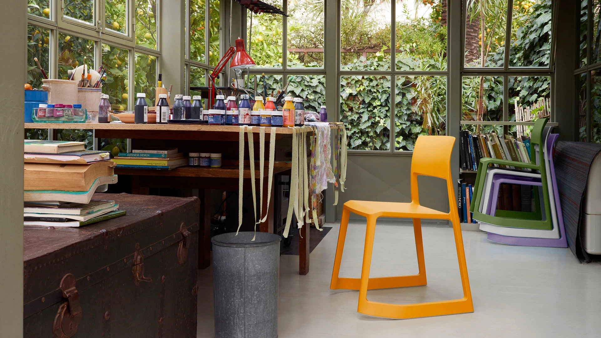
Instagram can still earn a place in a design brand’s marketing. But a beautiful feed, a growing follower count and a useful source of business are three different things.
A quieter account does not establish that Instagram is dying. It does give you a reason to look closely at what you publish, who sees it and what happens afterwards. A lighting label selling directly to consumers may need a different answer from an architecture studio seeking two substantial commissions a year.
Before you replace the channel or double the posting schedule, identify the part that stopped working.
Start with what actually fell
Choose the change you can see in your own account. Open a row for the first checks to make.
Fewer people see the work
Separate paid and organic distribution, then compare similar formats over comparable periods. Check follower and non-follower reach where available, posting volume and recommendation eligibility in Account Status. A month containing one unusually large Reel can distort the comparison.
First test: change the opening of one repeatable format, not the entire brand identity.
People watch, but do not investigate
Review profile visits, relevant replies and link activity alongside views. A satisfying film may give people no reason to look further. Make the product, project or point of view identifiable, and give interested viewers a useful next step.
First test: connect one post to a specific fit guide, project page or product detail instead of the general homepage.
People visit, but do not inquire or buy
Follow the route on a phone. Check whether the promised object or project is easy to find, the information is complete and the inquiry or checkout path works. Read the questions people ask in DMs. The gap may sit on the website rather than in the post.
First test: fix the missing information or broken handoff before commissioning another shoot.
The work takes too much time for the return
Record production hours and spend alongside the business outcomes you can reasonably trace. Distinguish essential launches, useful recurring formats and posts produced only to fill a slot.
First test: retire one expensive, low-value format and use the time to improve the strongest one.
Find the detail a photograph cannot explain
A chair can look distinctive without a viewer understanding what makes it different. Vitra’s Tip Ton range, designed by Edward Barber and Jay Osgerby, offers a useful example: it moves between a conventional sitting position and a stable forward tilt.
The profile photograph shows the shape. Movement explains the function. That contrast gives a design brand a concrete creative question to test, rather than another instruction to “post more Reels”.
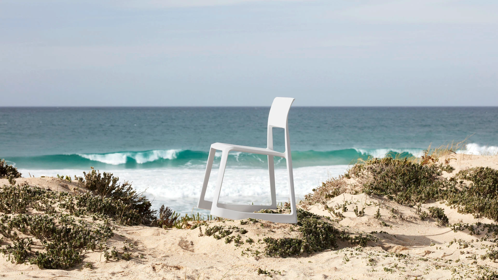
Start with the finished chair in a room. Establish its shape and setting.
Start with the forward-tilt action. Show what changes when someone sits down.
Which opening brings more people into the product story, and which leads to relevant product-page visits?
This is a FORTUNE test brief using a real design feature, not a report of Vitra’s Instagram performance. Its official Tip Ton film shows the movement that a still image leaves out.
The same approach can work across design categories. A jeweller could compare a finished-piece opening with a fastening demonstration. A textile brand could compare a styled room with the moment a curtain changes the light. Choose one real distinction worth explaining.
This loads Vimeo. You can also watch the film on Vitra’s Vimeo account.
Run a test small enough to learn from
Do not compare a highly produced launch film with a casual workshop clip and attribute the difference to one editing choice. Start with a question narrow enough to examine.
For one product family, does showing the object in use bring more relevant attention than opening on a finished still life?
Produce a short series using each approach. Keep the product category, approximate length, destination and production standard reasonably consistent. Change the opening idea rather than every variable.
Review reach and watch-time measures available in your account, then profile activity, relevant responses and website actions. Look for a pattern across posts. One result is a clue, not a rule.
Keep the approach that serves the intended audience and objective. Document what you learned. Do not turn a small creative test into a claim of statistical certainty.
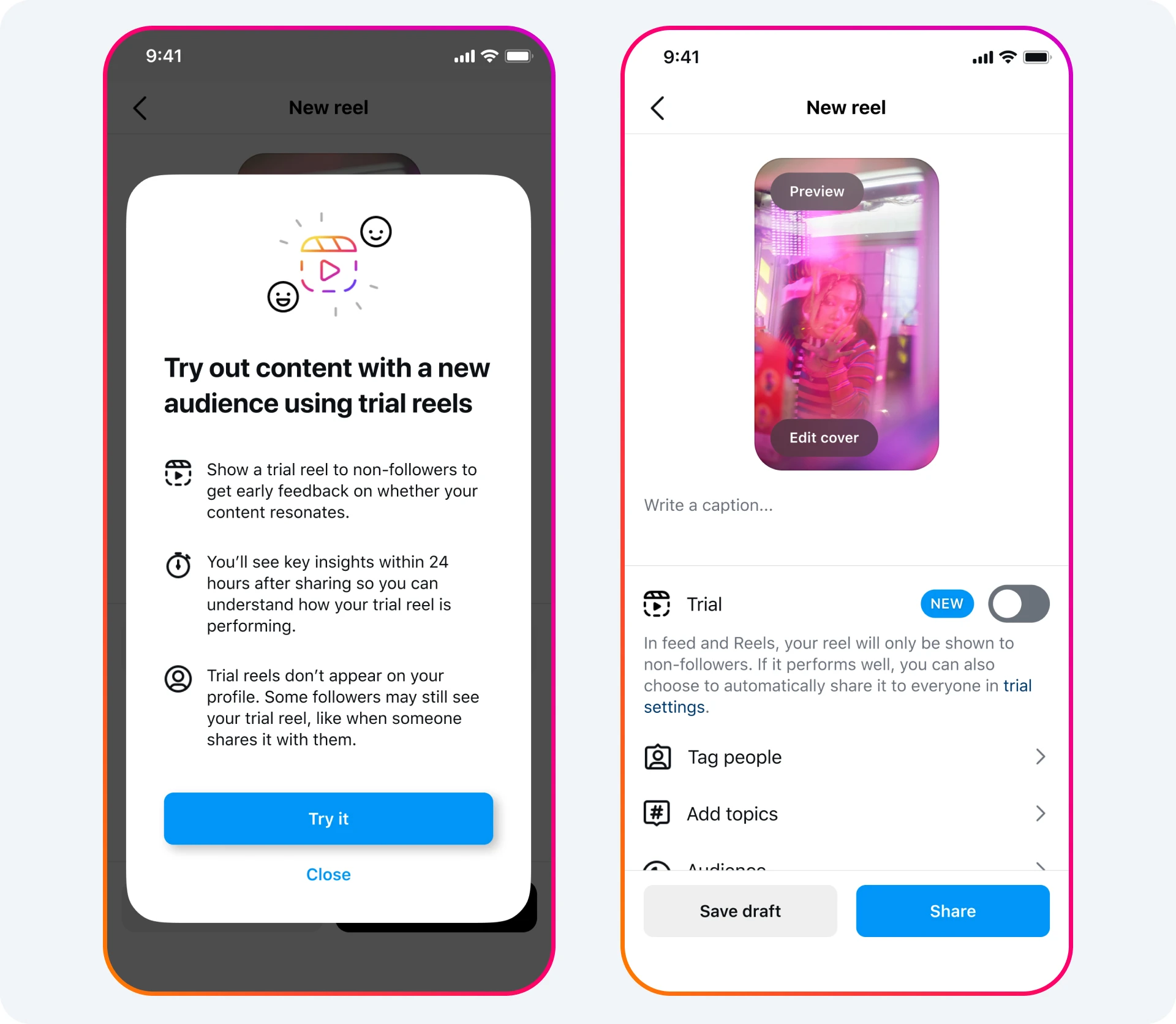
Trial Reels offer another way to explore a new idea by showing it to non-followers first. Meta announced wider availability in June 2025. Check the options in your account before building a workflow around the feature.
A trial is not a randomised advertising experiment. Its audience and distribution differ from a regular post, so compare like with like. Use it to explore a new opening or topic, not to promise a particular reach number.
See Meta’s official Trial Reels setup illustration
Give Instagram a job you can evaluate
A product brand
Instagram might introduce a collection or explain an unfamiliar object. Review relevant product visits, questions, purchases and the cost of producing that attention. Use tagged links where the format supports them.
A studio or practice
Instagram might help a referred prospect understand the work. Ask how inquiries found you and what helped them decide. A project conversation can matter more than a large audience with no commissioning intent.
Link tracking captures only part of the journey. Someone may see a post, search for the brand later or pass it to a colleague. Read analytics, customer conversations and sales information together. Avoid crediting Instagram for every order that followed a post, or dismissing it because every influence is not clickable.
Keep the website, email list and search presence useful alongside it. The outcome of the review may be a sharper Instagram programme, a smaller one or a decision to put more effort elsewhere. The account should earn that decision through evidence.
FORTUNE Marketing plans social strategy and creator partnerships for design-led brands. Talk to us about the role Instagram should play in your next collection, campaign or project.
Cover and chair imagery: Vitra. Tip Ton designers: Edward Barber and Jay Osgerby. Official interface illustration: Meta. Reviewed October 29, 2026.