

Hotel Website Design That Drives Direct Bookings
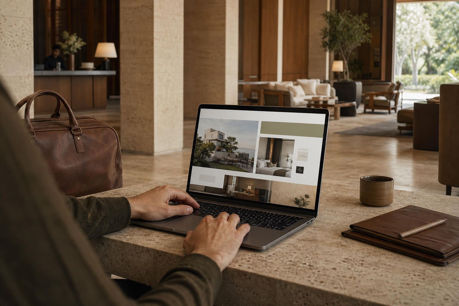
A hotel website has two demanding jobs. It must carry the atmosphere of the property and help a guest make a practical decision without friction. Many sites accomplish one and weaken the other.
Effective hotel website design connects mood with clarity. The photography creates desire, the structure answers doubt and the booking path keeps momentum. For a boutique hotel, that balance protects both the brand and the direct relationship with the guest.
The central idea: treat the website as a digital arrival sequence. Every page should move the guest from recognition to confidence to action.
From Lobby to Landing Page
A well-designed lobby guides movement without signs everywhere. Guests understand where to pause, where to ask and where to continue. The website should do the same.
Strong hospitality design uses hierarchy, proportion, light and material. Strong digital design uses headings, spacing, contrast, navigation and interaction. In both places, the user should feel oriented without noticing the work behind it.
Begin With the Booking Decision
Before choosing a layout, list the questions a guest must resolve:
- Is the hotel right for this kind of trip?
- Where exactly is it?
- What is different about each room?
- What does the rate include?
- Can I trust the images and reviews?
- What happens if my plans change?
The page hierarchy should answer those questions in that order. A poetic headline can set the tone, but the next section must provide evidence.
The Seven Parts of High-Performing Hotel Website Design
1. A clear first screen
Use one strong image, a specific positioning line and an obvious way to check availability. Avoid an automatic video that hides navigation or slows the first interaction.
2. Room pages that support comparison
Give every room category consistent facts: size, occupancy, bed, bathroom, view, accessibility and inclusions. Then explain what makes the room feel different. Guests should not need to open five tabs to compare options.
3. Photography with a job
Assign each image a purpose. Wide views explain layout. Details communicate material quality. Human moments show scale and emotion. Our photography work builds libraries around the full decision, not only the hero image.
4. A booking engine that feels connected
The visual shift into the booking engine should not feel like leaving the brand. Keep the logo, colors, room names, images and policy language consistent. Show total price early and make the path easy to reverse.
5. Proof near the decision
Place reviews, press, awards and policy reassurance close to room and booking actions. A wall of logos on the homepage cannot resolve a specific doubt later in the journey.
6. Useful destination content
Create neighborhood and itinerary pages with first-hand recommendations. These pages can strengthen hotel SEO, introduce the property’s taste and attract guests earlier in trip planning.
7. A fast mobile experience
Most travelers will meet the site on a phone, even if they later book elsewhere. Mobile design needs readable type, restrained motion, visible rates and large controls. It cannot be a compressed desktop page.

Design for Speed Without Flattening the Brand
Large image files, multiple fonts and heavy animation often create the exact delay that sends a guest back to search results. Performance is part of the visual experience because lag changes how the brand feels.
Google’s overview of Core Web Vitals focuses on loading, responsiveness and visual stability. In practice, hotel teams should compress images, reserve media dimensions, reduce third-party scripts and test the booking flow on average mobile connections.
A careful website design process makes those choices early. Performance should shape the concept, not arrive as a cleanup task.
Make Search Pages Feel Like Part of the Hotel
A hotel needs more than a homepage. Build specific pages for room categories, meetings, food and drink, wellness, weddings, accessibility and the destination when those experiences matter.
Each page should target a real question and offer a direct next step. Avoid producing thin pages that repeat the same generic copy. Search visibility grows when the site demonstrates useful depth.
Reduce OTA Dependence With Better Reasons to Book Direct
A direct-booking message should explain value, not simply announce “best rate.” Consider flexible changes, a welcome amenity, priority room selection, local guidance or a small experience that fits the property.
Then make the benefit visible on room pages and inside the booking path. If guests must hunt for the advantage, the OTA will still feel easier.
Measure the Journey Page by Page
Use analytics to find where confidence drops:
- landing-page engagement by traffic source
- room-page views and comparison behavior
- clicks into the booking engine
- booking-engine completion rate
- mobile versus desktop conversion
- revenue and cancellation rate by campaign
Paid traffic can amplify a working journey, but it cannot repair a confusing one. Align paid media landing pages with the promise in the ad.
A Practical Hotel Website Audit
- Open the site on a phone using mobile data.
- Try to identify the location and hotel type in ten seconds.
- Compare two room categories without using the back button.
- Find the cancellation policy and direct-booking value.
- Begin a reservation and note every surprise.
- Repeat the journey from search, social and an email campaign.
Every surprise is a design task. Fix the decision before adding another decorative section.
Frequently Asked Questions
How often should a hotel website be redesigned?
Redesign when the positioning, guest journey or technology no longer supports the business. Many sites need focused improvements every quarter and a larger rebuild every three to five years.
What should appear above the fold?
Show a representative image, a specific positioning line, clear navigation and an availability action. The first screen should establish identity and direction.
Does a boutique hotel need a separate mobile design?
It needs a mobile-first version of the same strategy. Priorities, image crops, navigation and booking controls should adapt to a smaller screen rather than simply shrink.
Build the Digital Version of the Stay
The best hotel website design makes a property feel specific while making the booking feel simple. It does not force atmosphere and usability to compete.
If your physical experience feels sharper than your website, contact FORTUNE Marketing to connect brand, content, search and conversion in one direct-booking journey.