
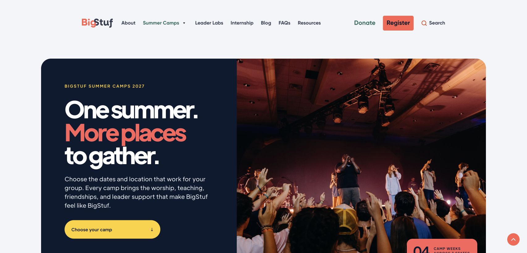
BigStuf’s old homepage could be specific: a five-day youth camp in Panama City Beach. As the program expanded into Illinois and Texas, the site needed to help a youth leader pick a week, figure out what the trip would cost, and know where to register.
We kept BigStuf’s identity and existing Webflow site, and continued to use photographs from camp. We changed the order in which people found things, starting with the homepage and carrying that work through the camp pages, planner, registration, Leader Labs, and support.
The homepage had to make room for more than Florida
The archived homepage led with Panama City Beach and sent visitors toward group registration or dates and pricing. The refreshed homepage separates two decisions: finding a camp and planning the full trip. Registration stays in the shared navigation for groups that already know where they’re going. The camp photography still feels like BigStuf. The links underneath it do a different job.
A youth leader can compare weeks before committing
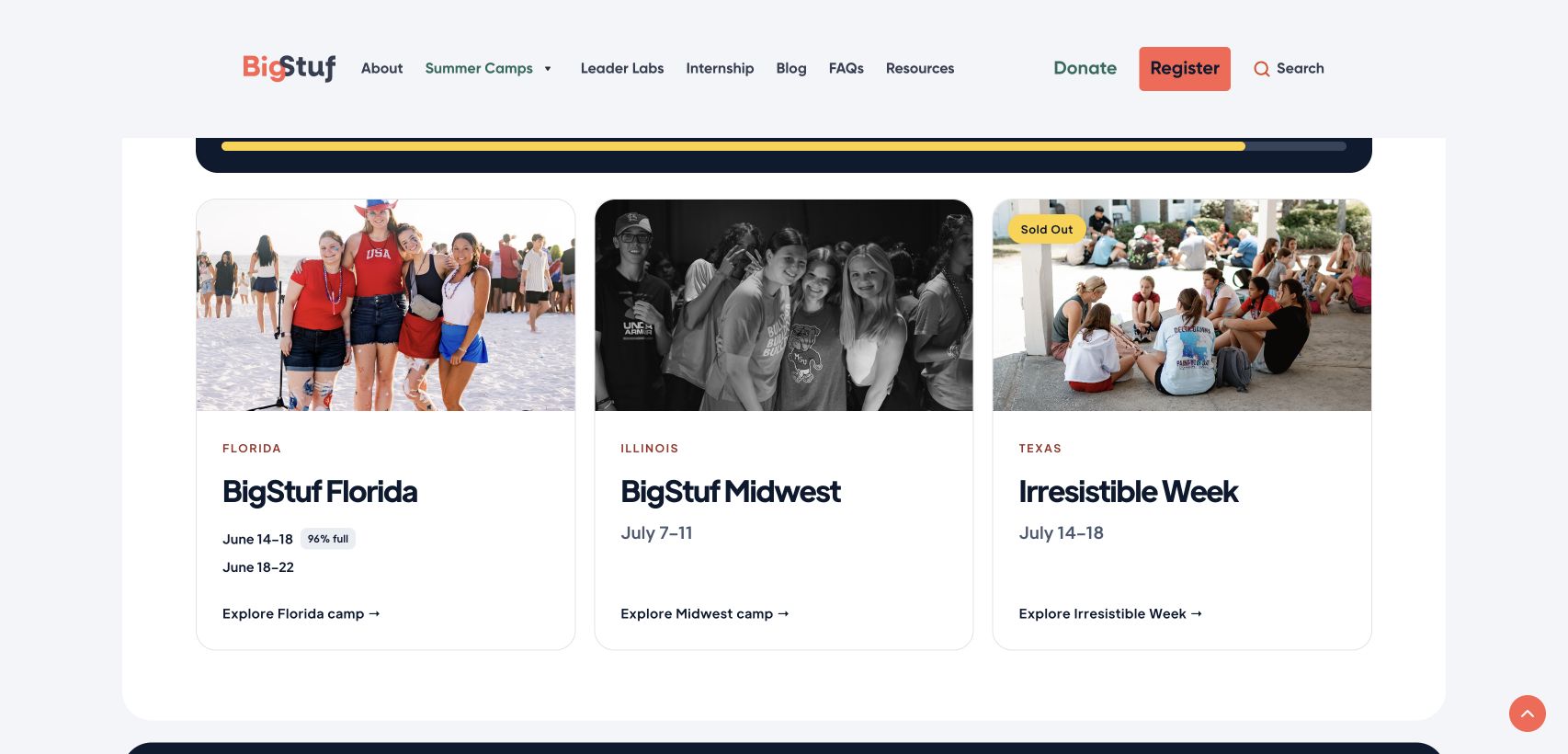
The old Summer Camps page described a beachside program. The new Summer Camps hub puts locations and dates together, then takes visitors to dedicated pages for details such as lodging, pricing, and arrival. A leader can compare Florida, Illinois, and Texas without piecing together the differences from three separate pages.
The camp planner helps with the next decision. It brings registration, transportation, and other trip costs into one estimate. A missing price stays visibly missing instead of looking like zero. That distinction matters when a leader is taking a budget to someone else for approval.
One program name, two different offers
Leader Labs had a different problem. The name covered sessions included at camp and a separate year-round subscription. We gave each offer its own section, explained what was included, and linked to the appropriate next step. A youth leader can now see the difference before following either link.
The files stayed. Finding the right one got easier.
Schedules, release forms, and parent materials were already valuable. We reorganized Resources around the work of getting a group ready and distinguished prior-season references from current materials. We added a direct path to the Help Center for questions that a download can’t answer. Later accessibility work added readable web editions for selected guides while preserving the original downloads.
The same work reached the parts you can’t see in a hero image. We made search and registration easier to reach from mobile navigation, reviewed page titles and internal links alongside the page layouts, and set up signup tracking to count a confirmed submission rather than a button click.
BigStuf could keep the site it knew how to run. A group leader could go from picking a camp to estimating the trip to finding registration and support without having to start over at each step.
Explore FORTUNE Marketing’s website design work