
Visual review
Website close reads / Interior design marketing
A portfolio can establish taste in seconds. Explaining what someone can commission, why a design decision matters and where to go next takes more care.
These three studios make useful material for a closer look at marketing for interior design firms. Each gives us a different decision to study, from the first inquiry to a project’s life beyond the studio website.
01 Beata Heuman / Personality and practical detail
A service page can have a point of view.
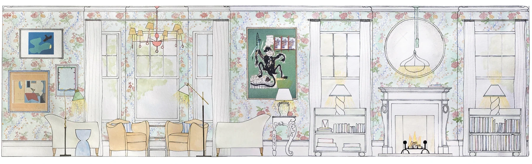
The drawing is doing a job a generic luxury-interiors photograph would struggle to do: it makes the studio’s taste unmistakable. Pattern, odd objects and contrasting shapes sit together without being flattened into a neutral mood.

What the page makes clear
The creative direction and interiors-team leadership are identified.
The practice describes its geographic reach and typical whole-property scope.
The inquiry starts with plans, property photographs and available budget information.
None of that requires a cold, corporate service page. The useful distinction is between visual personality and ambiguous information. A studio can keep the first without accepting the second.
The edit to try: put your actual commission scope beside an image or drawing that could only belong to your practice. Replace a vague “get in touch” with the two or three things your team needs to begin.
02 Workstead / One brand, different decisions
Buying a lamp and commissioning an interior need different routes.
Workstead puts Buildings and Interiors beside Lighting in its navigation. Its About page also separates inquiries for the two practices. That simple distinction matters for studios that design spaces and sell products under one name.
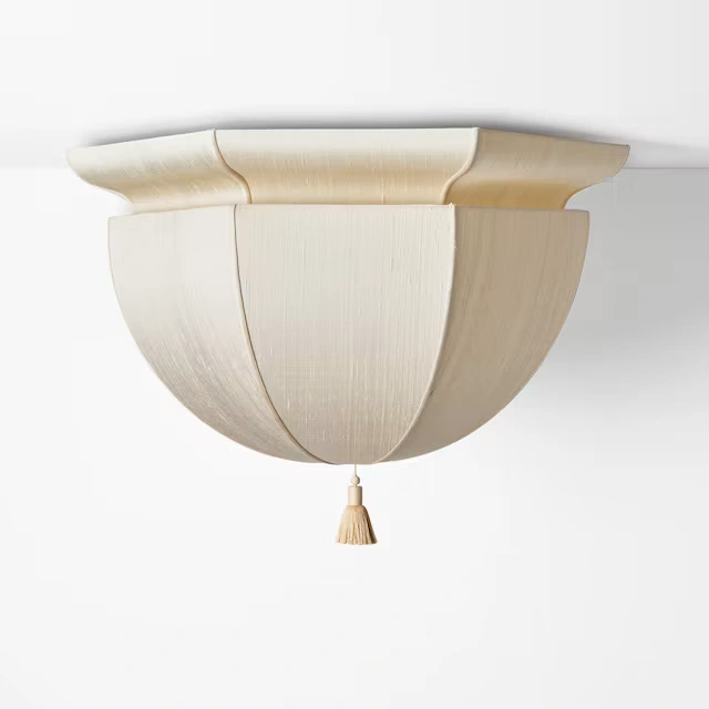
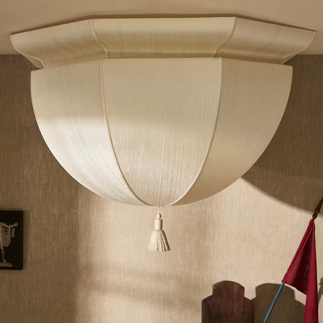
On the Lantern Demi Large page, atmosphere sits alongside dimensions, finish options, a lead time and specification and CAD downloads. A designer considering the fixture can move from liking it to checking whether it fits.
The product visitor
Needs to check the object, its dimensions, finishes and technical files before selecting or specifying it.
The project client
Needs to understand the practice and describe a potential commission. Workstead’s inquiry form asks for project type, location and timing.
The edit to try: trace those journeys separately on your own website. If both end at the same general inbox, check whether each visitor has received the information their decision requires.
03 Norm Architects / The story beyond the photograph
Give the project something people can talk about.
The Norm Studio project page explains the practice’s Copenhagen workplace through its existing building, material choices and collaborators. Those specifics give readers more to remember than an aesthetic label.
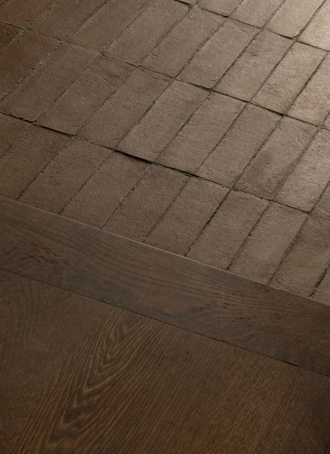
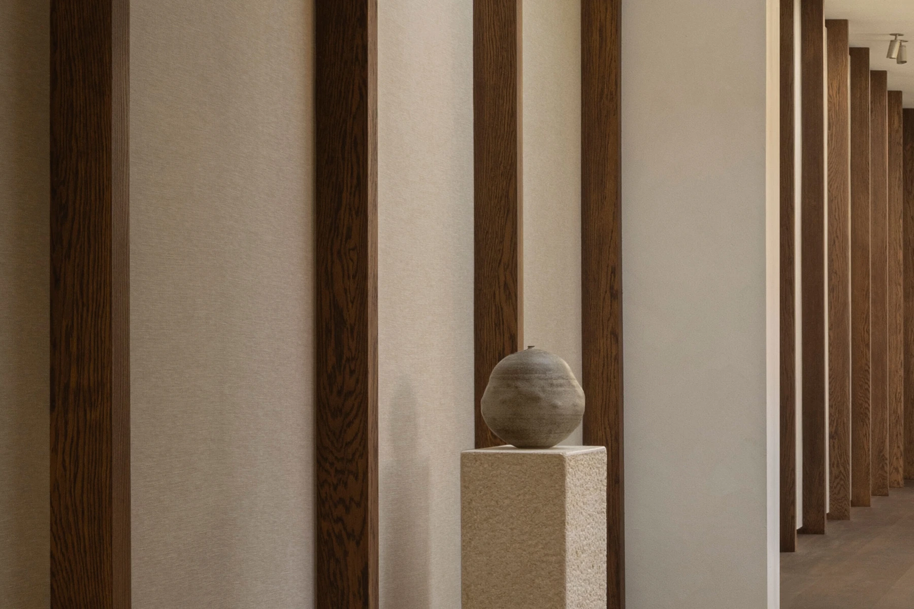
Two details worth explaining
The materials have a reason.
The brick-to-timber transition connects courtyard and interior. The textile panels serve as surfaces for pinning work in progress. The project account connects what we see to place and daily use.
The same page names collaborators and offers a press package. The project becomes easier to research, credit and reference.
For a smaller studio, one precise account of a difficult decision can do more for a project page than a long statement of philosophy. Explain what changed, why you chose it and what the photographs cannot tell us.
From project story to earned coverage
A useful project page gives others a reason to link.
Picture a material supplier writing about a completed installation. A beautiful gallery may show the result. A credited project page can also explain the application, name the product and give the supplier a reliable source to cite.
A stable project URL, named team and materials, a short factual account and an image-permissions contact.
A supplier’s application story, a photographer’s commission feature or an editor’s interest in a particular design decision.
When coverage needs more context, the project page gives readers somewhere specific to go.
That is an earned-backlink opportunity, not a guaranteed result. Linking out to the studios in this article credits our sources; it does not create backlinks to FORTUNE. Paid ranking links and routine link swaps are a different practice, covered in Google’s link-spam guidance.
Apply the review
Which part of your website needs the next edit?
Open the statement that sounds most familiar.
“People admire the work but misunderstand what we offer.”
Start with the service page. State the commission types and scale you accept, where you work and what you need from an initial inquiry. Ask someone outside the studio to explain it back to you.
“We sell products and take commissions, but the paths blur.”
Start with navigation and landing pages. Follow one product inquiry and one project inquiry from arrival to contact. Add the missing decision information, not another general brand paragraph.
“Our portfolio looks good, but there is little to reference.”
Start with one project interview. Capture the brief, the team’s role, one consequential decision and correct credits. Publish a source page before pitching the story to a relevant collaborator or editor.
If those routes already work but suitable prospects rarely find the site, the next task is discovery. Our interior design SEO guide explains how project evidence can support search without turning the writing into keyword repetition.
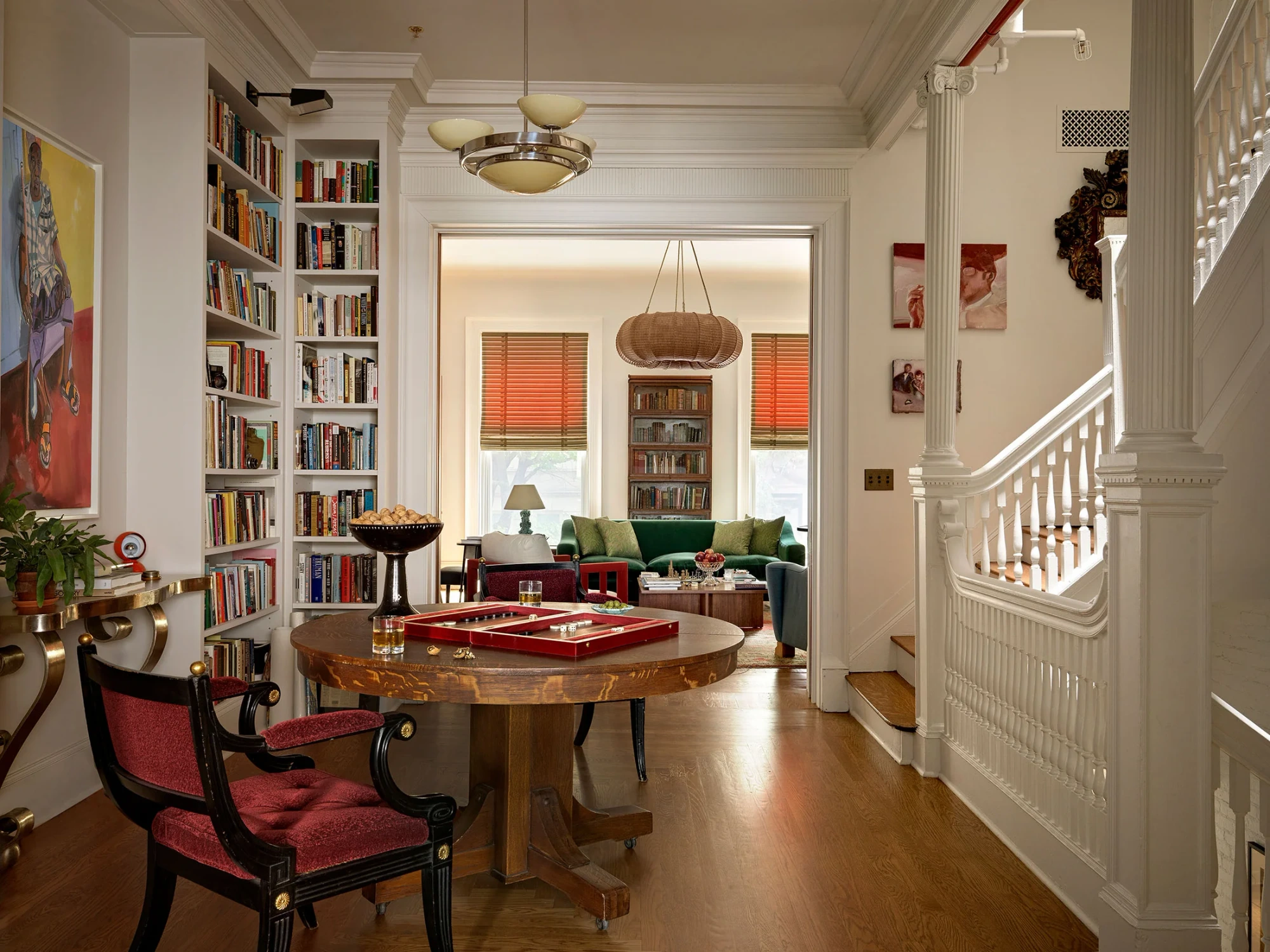
Public pages reviewed October 29, 2026. These are independent editorial examples, not FORTUNE client case studies or performance audits. Beata Heuman artwork and Workstead product imagery belong to their respective owners. Norm Studio photographs shown here: Jonas Bjerre-Poulsen. Cover: Beata Heuman’s Manhattan Brownstone, photographed by Simon Brown.